Apple’s iOS 15 update was threatening to upend our long-standing understanding of push notification title character counts.
Sounds like a problem for Excel-man, (a totally real superhero).
Problem
The iOS 15 update made the iPhone notification more visual with a larger icon that was more dynamic. The only issue was that it took real estate away from the notification title and put the title on the same line as the timestamp. A timestamp can be as short as “5m ago” or as long as “yesterday.”
While it wasn’t certain how many characters the push titles were truncating to, it was better to be safe than sorry. I was giving the task of looking through the Eno Insights portfolio of push messages and look for title that we needed to update.
Approach
- Visualize how the push titles would look like when truncated
- Rewrite push titles that truncated important info
- Discuss suggested rewrites with the team
Visualizing how the push titles would look like when truncated
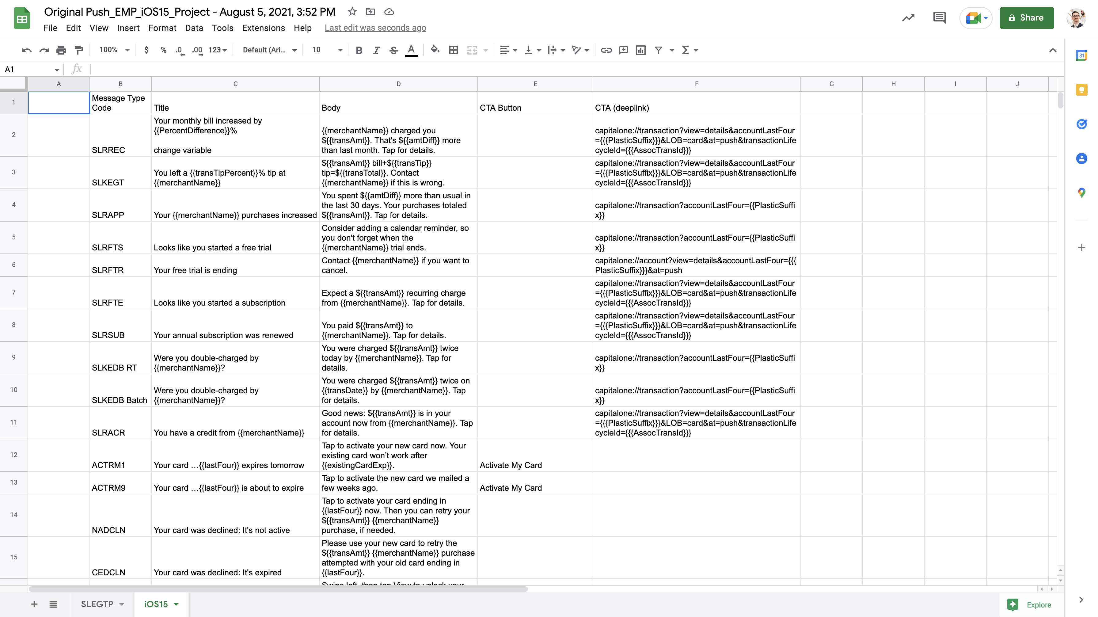
Our project manager collected the push messages from the Eno Insights portfolio and put them in a spreadsheet.
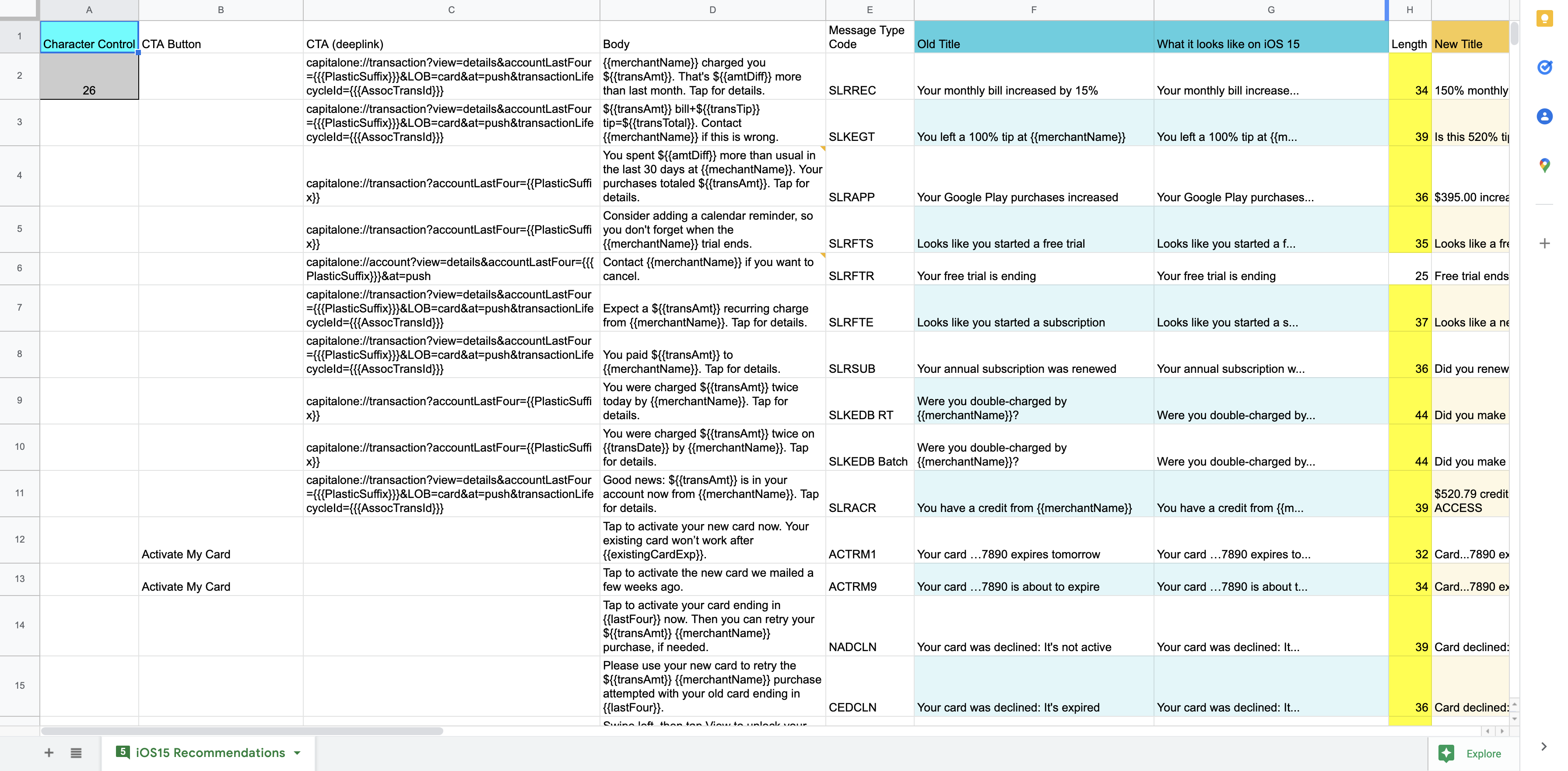
I added a column to measure the length of the current titles. In extreme cases, iOS 15 could truncate push titles to 26 characters. This was drastic decrease from the previous recommendation of 37 characters.
Using conditional formatting for dynamic highlighting
All current titles were longer than 26 characters except for one. To highlight the longer titles, I used conditional formatting. The condition was a formula that grabbed the number in A2.
This made the spreadsheet flexible. I could change A2 to any number and the spreadsheet would highlight or un-highlight cells to correspond with whether they were more or less than that number.
Visualizing the truncation
Next, I set up a column for how the current titles would truncate in iOS 15. Using the =LEFT() formula, cells in this column would only display the left x number of characters (in this case 26).
With a flare for the authentic experience, I also used a =TEXTJOIN() formula nested within an =IF() formula to add the ellipses at the end of the title if it was being truncated.
Rewriting push titles that truncated important info
With an idea of which titles were getting truncated, it was time to see where that was a problem.
As any content designer worth their salt knows, it’s best to frontload important information at the start of a push title or email subject line. Most of the push titles were already written like this. They didn’t need to be rewritten.
However, the exercise also highlighted some oddballs. This collection had many similar notifications for related experiences. Some of these weren’t following consistent content patterns despite being nearly identical in subject matter.
Giving alternatives with my rewrite
When I write anything, I want to consider multiple approaches to the same prompt. It gives space for many mediocre suggestions while allowing the best gem to steal the show.
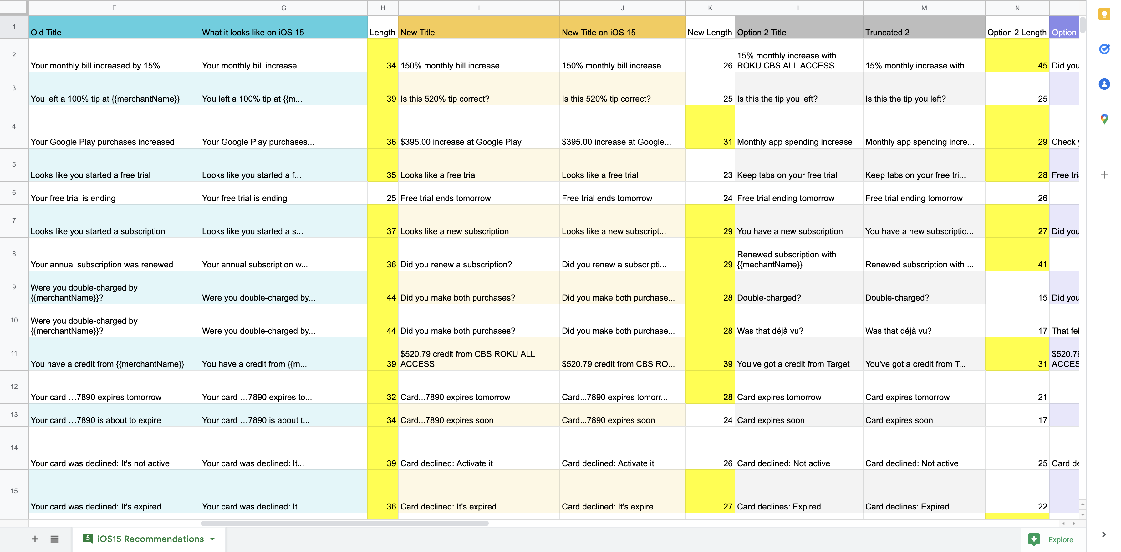
To do this in the spreadsheet, I duplicated and color-coded my columns for up to 4 alternatives to the current title.
Some rewrites were not winners and some were more creative than was helpful. For example, there was notification that detects when there are two identical charges to a card and ask the customer if they might have been double-charged accidentally. My suggested title: “Was that deja vu?” Not the best at getting to the point but certainly a fun approach.
Discussing suggested rewrites with the team
With a collection of multiple suggested rewrites, I presented the spreadsheet to the team. Their feedback helped to trim down the suggestions to the good choices.
It was very helpful to hear from a circle of more experienced designers. I took notes on the insights and gained a better appreciation for how to defend brand standards.
Result
There were three results from this project:
- We understood exactly how iOS 15 would affect our current portfolio of push messages
- We had rewritten push notification titles on the ready for when/if the line of business decided the truncation was a problem
- I was able to show other content designers how to use a spreadsheet to understand message truncation


