Problem
Key Web keeps costs low for small businesses. One method they do that is by outsourcing part of the writing process to the business owners themselves. The problem is they might not know what to say, let alone how to say it.
Approach
- Interview the client in a UX Strategy Session
- Map company attributes to a website flow
- Coach the client through the writing process
Interviewing the client in a UX Strategy Session
Most web design companies start with a consultation or an onboarding interview. Key Web did that as well as anyone. We would ask the run of the mill questions about what industry the company was in and where they were located.
The UX Strategy Session, however, was a leap forward in shifting an hour long conversation into a 3 hour customer-focused exploration. The session focused not just on our clients’ needs but on our clients’ customers’ needs.
Our framework investigated:
- Goals – what did their customer want to accomplish?
- Challenges – what was getting in the way of those goals?
- Needs – what did the customer need so they could overcome those challenges?
- Solutions – what could the company provide to solve those needs?
My role in this process was to write down the answers that the company was giving and look out for more questions to ask. While our brand strategist led the discussion, I asked follow-up questions when I thought elaboration would uncover an interesting story or competitive advantage.
Mapping company attributes to a website flow
My job was then to take the UX Strategy Session and turn it into a website flow. I cross referenced the customer profile section with the Why-How-What section. By looking for intersection points, I could strategize how to present company attributes in the context of what mattered to the customer, starting first with the homepage.
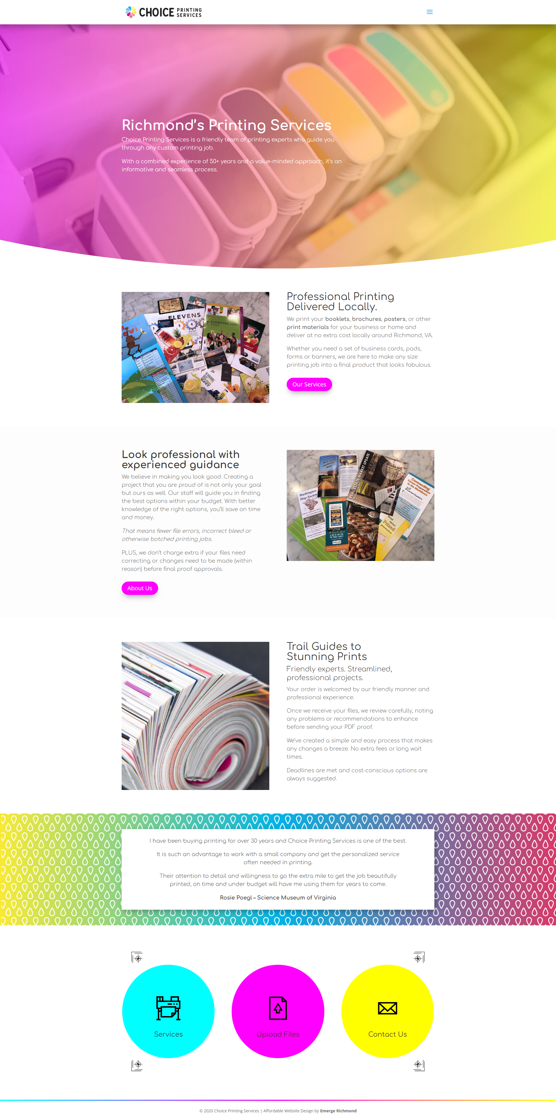
Choice Printing Services was a company that helped their customers professionally print or copy. They were in competition with large online services like Snapfish or VistaPrint that are cheaper but impersonal.
From the UX Strategy Session, I knew that Choice Printing had a competitive advantage in customer service compared to the big companies. But the customer didn’t start with the knowledge of why that was important. For the customer, they knew they needed a product and didn’t care how the sausage was made.
In my notes, I reordered Why-How-What into the customer’s knowledge journey from What to How to Why.
- What can Choice Printing do for the customer?
- How does Choice Printing help the customer through the process?
- Why was Choice Printing better than other alternatives?
This way, the copy was guiding the customer from a myopic focus on what they thought they needed to a broader focus on what they actually needed.
Coaching the client through the writing process
I then coached the client through this outline for the homepage. I added notes about the length of each section, the tone and the first and secondary points. I highlighted the need for an elevator pitch at the top and a testimonial at the bottom to drive it home.
I explained to the client that each section was allowed to encompass more than what I outlined. The outline was just a starting off point. Each section could overlap with what came before and after it. It could dip into why their business was better than the alternative and tell a complete story.
Once the first draft was written, I refined many of the headlines and reworded some parts and passed it off to the designer to finish the web design process.
Result
The finished website had a better content flow than the previous website. It said more about what the business stood for without distracting the customer from what they were there for.

