
Objective
Create a plan for how to design a scalable success screen pattern.
Strategy
The local design system team was working on coding design patterns that could be used across experiences. The work was a prime opportunity to define the ingredients in an optimal success experience before getting into what success screens should looks like specifically..
I was excited to work on success screens as the spiritual successor to the error message guidelines. Both error dialogs and success messages show up constantly in multi-step user flows.
Process
To create a successful success message pattern, I broke my work into multiple stages:
Discovery: Research
I started with research from every authoritative source I could find. At this point in my time working on a design system, I had a catalog of 30-40 design systems. I grabbed every example of success message guidelines then I took notes in a sticky note program.
As I noticed themes, I grouped sticky notes and labeled the theme. Some notes were about the principles being recommended like “celebrate appropriately” which had to do with not overdoing the confetti for minor actions.
From this research, 3 thematic purposes for success messages emerged:
- Confirm that an action happened correctly
- Celebration of a milestone
- Suggest next steps
This helped me to say with confidence that success screens should accomplish 1-3 purposes. Most design decisions should ladder up to how the success message accomplished its intended purpose.
Discovery: Audit
Now that I had an authoritative stance on how success messages ought to function, it was time to look at what designers were already doing.
For a large organization, finding every example of a success screen could have been impossible. A success screen is not a carefully-labeled, standalone product in a portfolio. It’s a single slice out of a much broader user flow.
Often, we solved for auditing examples by requesting submissions from willing designers. This gets a handful of submissions and has the added benefit of inviting designers into the in-progress project for early feedback. The downside is that not everyone participates.
But I had one clever trick to get a larger list of success screens.
I knew that most success screens used the same green checkmark icon from a legacy design system. In Figma, you can generate a list of all projects using a particular design component like an icon.
I copied list of every project using a green checkmark to Google Sheets. I opened each project, one by one and found where the checkmark was.
I secured 103 success screens this way from dozens of projects. These projects were old and new from teams everywhere in the design org chart. Using this clever trick, I was able to see beyond the horizon of willing participants to get a near 100% audit of every success screen that had been designed.
Pattern design
Once I had my list of success screens, I found similarities in how the messages were structured. I looked at content phrasing, icons and pulled out specific themes.
My tool of choice was Google Sheets. I recorded messages with the phrasing that was not context-specific. For example, I would write a phrase like “you’ve filled your water bottle with water” as “you’ve [past tense action] your [object] with [favorable item].” This allowed me to group similar phrasing and generate statistics ranking what was most popular. It also gave me insight into how to consolidate similar phrasings with small differences unlikely to make an impact on the customer experience.
I noted the use of adverbs like “successfully” that added to success message length and the use of passive voice to shorten messages. From my research, using “successfully” was redundant. From our content guidelines, using passive voice was discouraged. In both of these instances, I weighed on the advantages of deferring to how things were already done (descriptive) versus suggesting how things ought to be done (prescriptive). I consulted with the design community, especially content designers, and incorporated a firm opinion on these two points into the guidelines.
The final boss of success messages was a seemingly small difference with broad, design philosophy implications. Should success messages be written in the first, second or third person (or avoided altogether)? Should it be “we’ve filled your water bottle,” “you’ve filled your water bottle” or “your water bottle has been filled”?
The bigger principle in this decision is whether the customer “owns” the action they’re completing using “our” technology. It’s the type of principle that benefits from forming a hypothesis, investigating examples, asking the design community and keeping an eye out from then for how we’re being consistent.
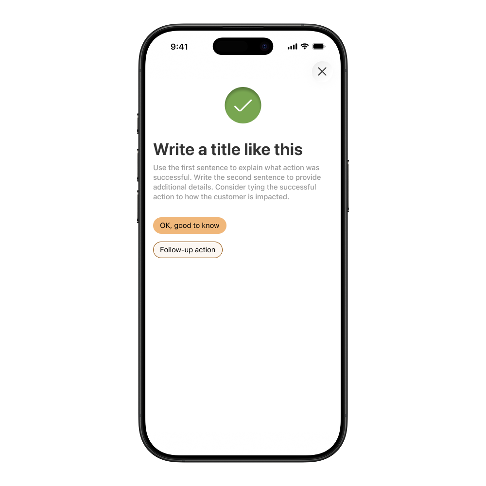
The output of this phase was 3 success screen variations with a content pattern for the icons, title, body content and button texts.
Results
The design pattern was coded into a consumable component. This meant that designers could copy the success screen into their Figma file, use the embedded guidelines to write content and hand it off to development. Their tech team could then use the code from the design system to limit development time. When it came time to update icon designs, the success screen updates went live across every instance without individual team adoption.