Writing for Dualities
For most businesses, there are going to be multiple attributes to write for. By intersecting two attributes, you can allow the interplay to carry through the whole copy.
This often comes up with the classic “iron” (or “unattainable”) triangle: speed, quality and affordability. In this triangle, you can have one or two attributes. You can’t have all three.
The iron triangle constrains copywriters to respect the tradeoffs when describing their subject. Sometimes there’s a speed versus quality argument, a quality versus affordability comparison or something that pits affordability against speed.
Emerge Richmond, the small business division of my former employer, Key Web Concepts, has a mix of cost-efficiency and professional quality.
Quality Web Design at a Good Price
Unlike Key Web web designs, Emerge designs use a page builder to cut out development costs. Small businesses and startups get a professional-looking website for a good price.
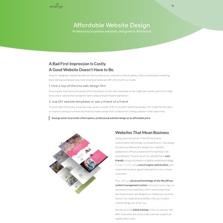
The duality of these two attributes is strongest on the Web Design page, starting first with the headline:
“A Bad First Impression Is Costly. A Good Website Doesn’t Have to Be.”
The headline alludes to the importance of both quality and affordability. The first sentence implies wasted business opportunities due to bad first impressions and bad first impressions due to a bad website. The second sentence implies there is a way to build a good website without high expense. Together, they communicate the value of a professional-looking website at an affordable price tag.
Agitating the Problem While Covering a Lot of Ground
For the body copy, I knew I wanted to play out the duality of quality and affordability.
I borrowed the “agitation” step from the PAS copywriting model. The headline teased out two problems. The problem in the first half of the headline is the costliness of a bad first impression (i.e. a bad website). The problem from the second half is the struggle for an affordable website. The body copy needed to agitate these problems before providing a solution.
To agitate these dual problems, I needed to divide and conquer.
First, I tackled agitating what happens with a poorly-designed website and presented the most expensive route as the solution to poor quality.
“Hire a top-of-the-line web design firm”
Then, I followed this up with a cheap alternative that threatens poor quality.
“Use DIY templates or ask a friend of a friend”
After exposing the weakness of both routes, the concluding sentence shows how Emerge solves both problems.
“Emerge exists to provide a third option: professional website design at an affordable price.”
This statement brings the topic home without leaving anything guesswork. It’s a payoff for the spark of curiosity at the top of the page.
With the first half of the page laying the groundwork, the second half goes into more detail about the features of Emerge’s web design process. Along the way, the copy reinforces the duality of affordability and professional quality with examples of where Emerge adds value for the reader.
It concludes with a cheeky suggestion that the previously mentioned friend-of-a-friend stay just that: a friend. Leave the web design to the professionals.
Feel free to read more on the Emerge website.


