
Objective
Create a memorable Park(ing) Day event by communicating the value of replacing parking with more efficient land use.
Deliverables
- Slogan
- Stickers
- Press release
Problem
Park(ing) Day is a yearly event that takes over a parking space and redesigns it as a park or public space. This demonstration shows how even one single parking space could be used for something better.
In perfectly empathetic world, drivers could see the demonstration and think about how they could forego the convenience of ample parking if it meant that the city could use the land for affordable housing, beautiful public spaces and walkable communities.
But I’ve been to enough civic association meetings to know that parking is an explosive subject. If you preach to drivers about the negative effects of parking, you’re poking at a sore wound.
Drivers in Richmond already feel the claustrophobia of surface parking lots turning into housing and street parking turning into bike lanes. Population rises. Demand for parking goes up and supply dwindles.
This stress creates some antagonism in conversations around infrastructure for cars, biking, sidewalks and transit. In the zero-sum game, paving the way for car-free alternatives comes at the expense of driver convenience.
Strategy
For the marketing materials I was putting together for Park(ing) Day, I wanted to cut through the antagonism between pro-parking and anti-car people. My strategy was to promote the direct benefits of car-free travelers before speaking to the indirect benefits of less parking.
Car-free travelers give an immediate and direct benefit to drivers. Each person who replaces a car trip with something else is opening up a parking space to be available for someone else.
When enough people replace car trips with taking the bus, riding bikes or walking, the overall result is fewer cars out and about. Fewer cars in Richmond means more parking spots available for the drivers. It also means that local business can still get customers without a 1:1 ratio of parking spaces to customers.
And then, after car-free travelers release the pressure on parking, we can have the conversation about reducing parking in the city and the many benefits that brings to everyone who lives here.
Instead of a zero-sum game, this message presents a mutually beneficial partnership.
Slogan
The next step was to capture that mutually beneficial message in single phrase.
The slogan idea came to me as I was sitting in a restaurant in the Shockoe neighborhood. On the wall and in their menu, they offered to pay any customer’s parking fee. It was a critical investment in retaining customers in a part of town where parking wasn’t free.
But all I could think as I was eating was that I was missing my opportunity to qualify for subsidized parking because I biked to the restaurant. If I had decided to drive, my decision would have cost the restaurant a parking fee. Everything else being equal, my decision not to drive made me a more profitable customer.
So where was the thanks for not driving? I didn’t get a discount on my meal, a high-five, pat on the back or a free sticker saying…
“I freed up a parking space because I didn’t drive.”
No…
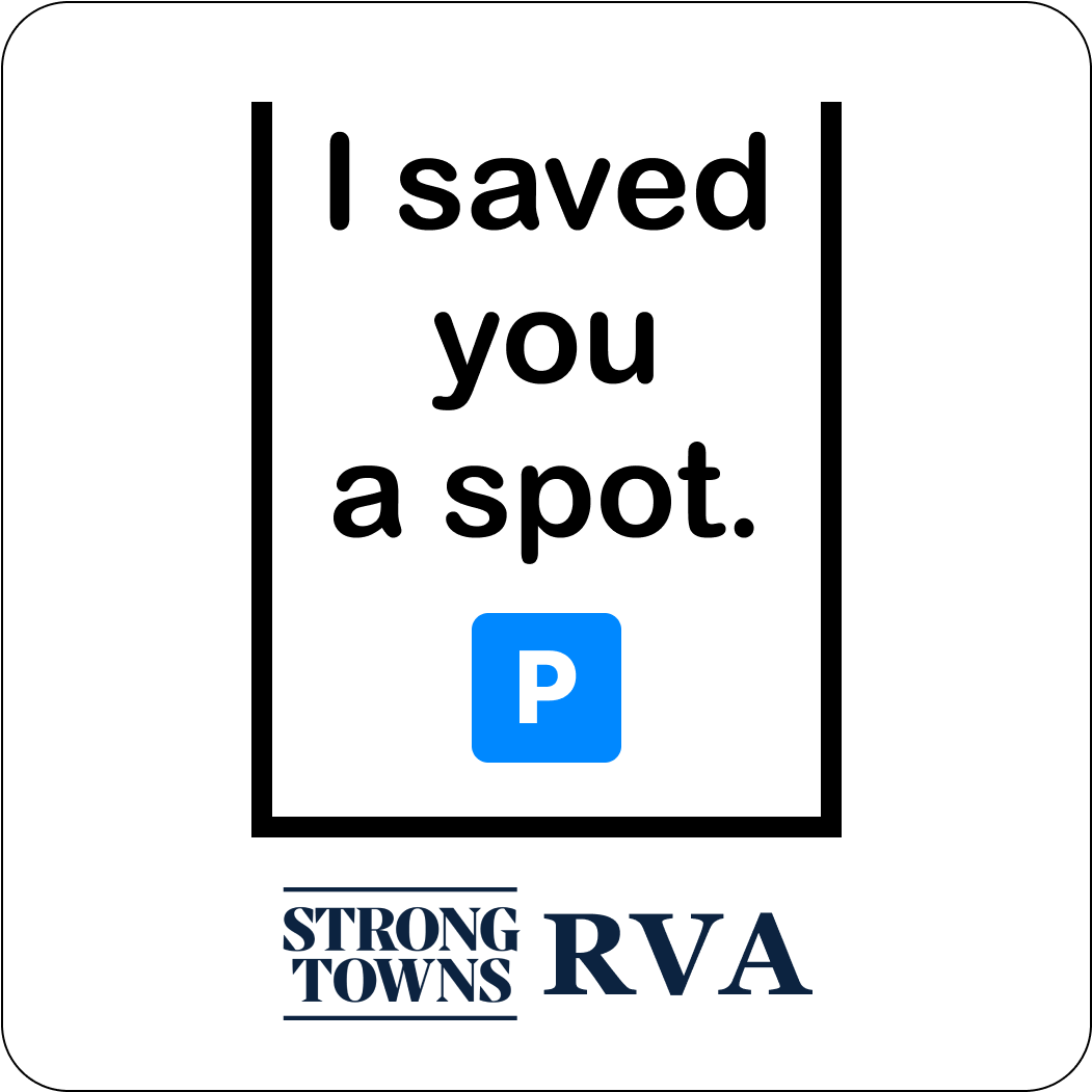
“I saved you a spot.”
That’s it! Or at least close enough. I (a cyclist) saved you (a fellow driver) a single parking spot. I (a bus rider) saved you (the restaurant owner) a parking spot fee.
The slogan said what I wanted it say. It wasn’t overstating how bikes will revolutionizing the world of transportation. It was a neighborly invitation to love and enjoy the city alongside me.
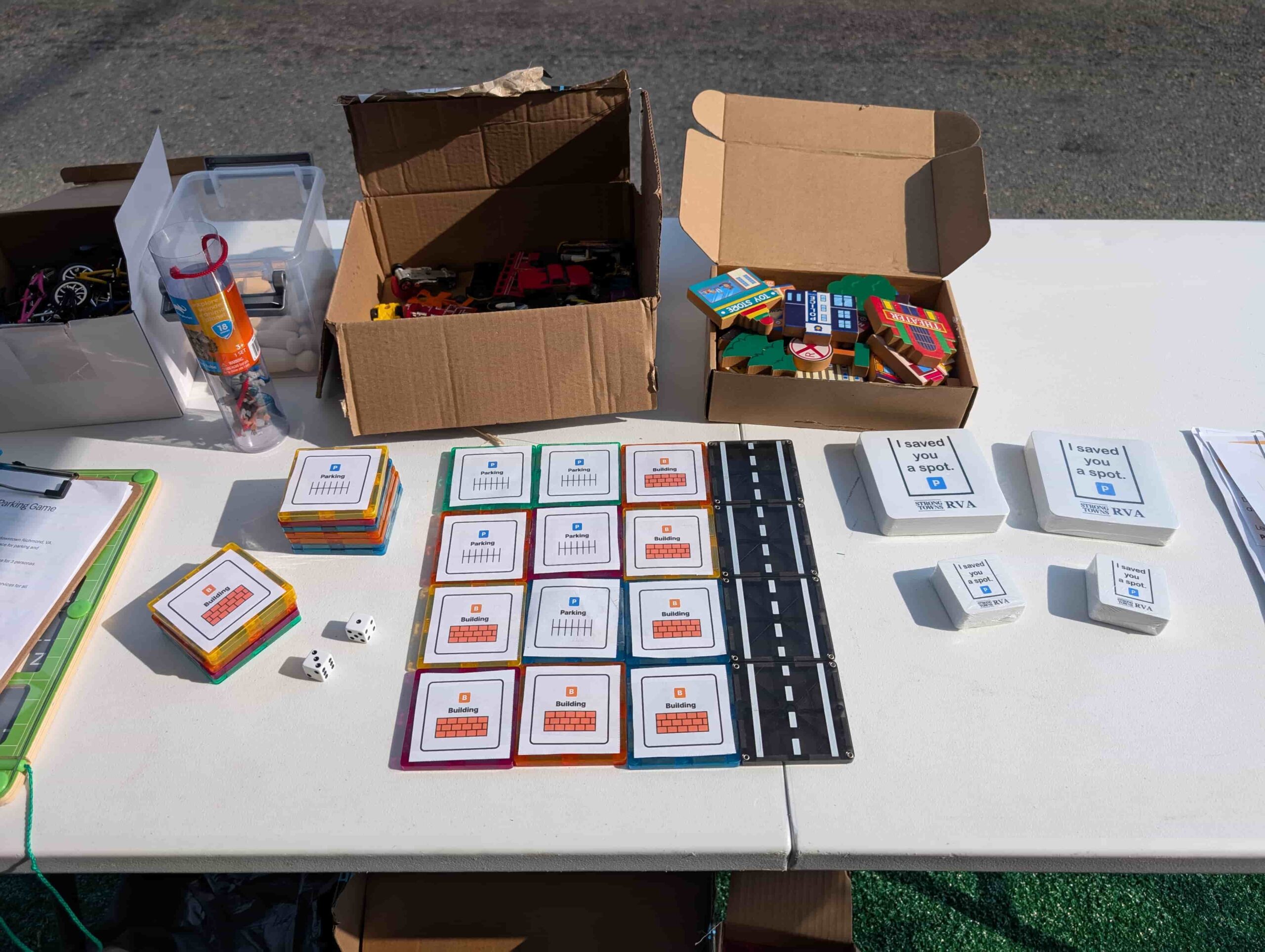
Stickers
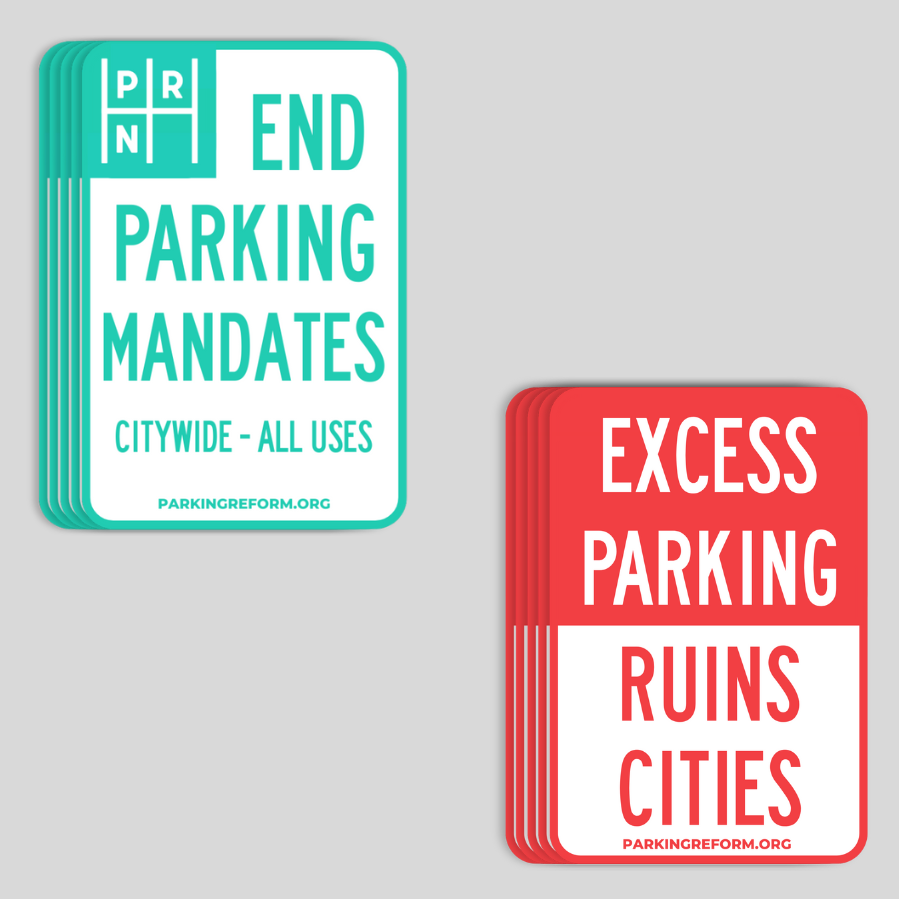
To design the stickers, I took inspiration from street signs. Or that is to say, I did the obvious thing. Of course any sticker about parking is going to use a street sign style. It’s the same style that Parking Reform Network uses in the sticker they sent me for the event.
So here’s a breakdown of my sticker:
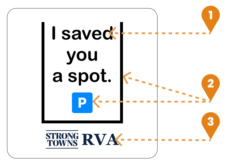
- Typography: I used Arial Rounded because that was a close match to wooden signs I’ve seen in national parks. Using sentence case and rounded letters was less aggressive-looking than the official highway sign fonts.
- Shapes and layout: The “P” in a blue squircle and the black border on 3 sides make the parking spot imagery explicit. The border is close to the height-to-width ratio of real parking spots while optimizing for font size and spacing. While real parking lines would be white, inverted the colors reduced legibility at a distance.
- Logo: While the logo is small, Strong Towns RVA leadership considered it necessary for putting our name behind our message.
Results
The Park(ing) Day event drew dozens of passersby. We thanked people for not driving, presented them with a sticker and invited them to visit our table display.
Because we worked on creating inclusive and positive messaging, we were able to have civil conversations with people who took the opposite view on parking reform. The positive framing made the story less contentious so that local news could publish our press release and a representative from Richmond’s City Hall felt comfortable attending.
Within a week after the initial event, we reused the same table and stickers for an additional event. We anticipate continuing to use our materials at many upcoming events.