
Objective
Transform existing error message guidelines into a full-stack self-service solution with visually digestible educational resources.
Deliverables
- Updated error messaging guidelines
- Educational workshop
- Fill-in-the-blank content patterns
- Coded patterns for generic error dialogs
Strategy
In the first rewrite of error message guidelines, I was careful to rework existing error types and build off of legacy materials. You can read more about my process here.
This tied my hands, but it was helpful training wheels. In a large organization, the institutional knowledge runs deep. There is lore written into every forgotten corner of the servicing experience.
It’s easy to ignore existing materials and pat yourself on the back for reinventing the wheel only to run into the same issues someone ran into before you. I could have disregarded current examples and said, “I think error messages should look and be written like this.”
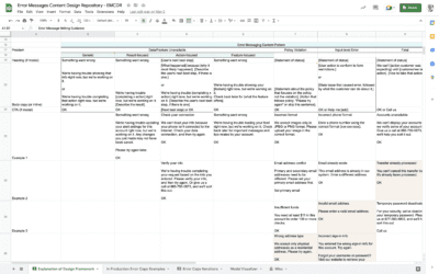
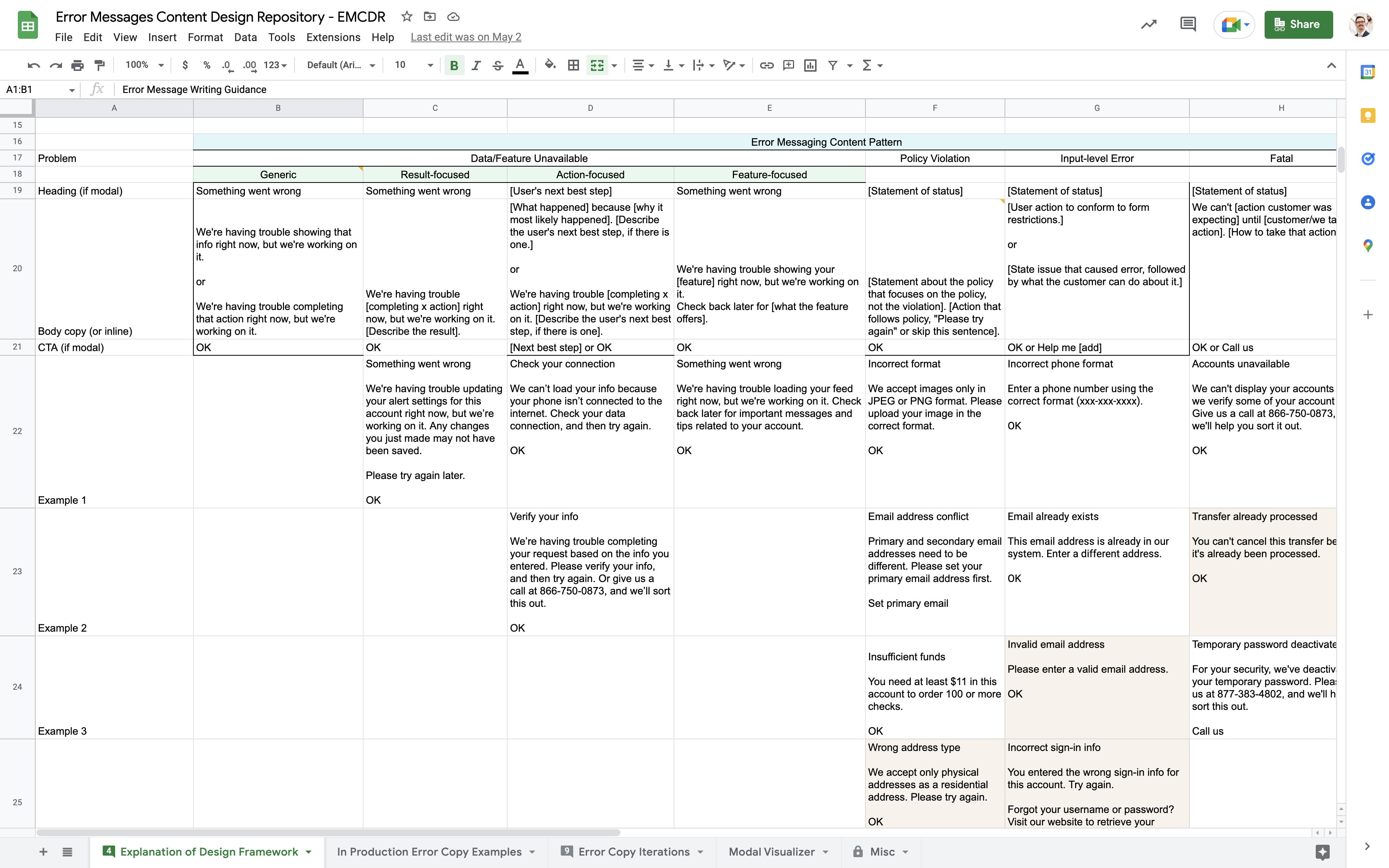
Instead, I used what structure was there. I audited existing messages, looked for common phrasing and condensed the results into fill-in-the-blank patterns based on the error types someone else came up with.
The result was mostly descriptive of current error messages with some small improvements.
This left gaps in what ideal error message guidelines should look like. When the team began work on coding an error dialog component based on the guidelines, I knew the timing was perfect for identifying and fixing the shortcomings of error message guidelines 1.0.
Process
- Identifying user problems from error message guidelines 1.0
- Recategorizing error types
- Writing new generic error messages for versatility
- Communicating visually with an updated guidelines page
1. Identifying user problems from error message guidelines 1.0
By the time the second phase of this project came around, I had lived with the results of the first pass for almost 2 years. In that time, a week rarely went by when I didn’t point a design to the error message guidelines. I’d offer to walk through the instructions with them and fill in details that they might have been tripped up by.
This helpfulness took over a chunk of my time but let me see in real time where designers were getting stuck.
I noticed 3 problems:
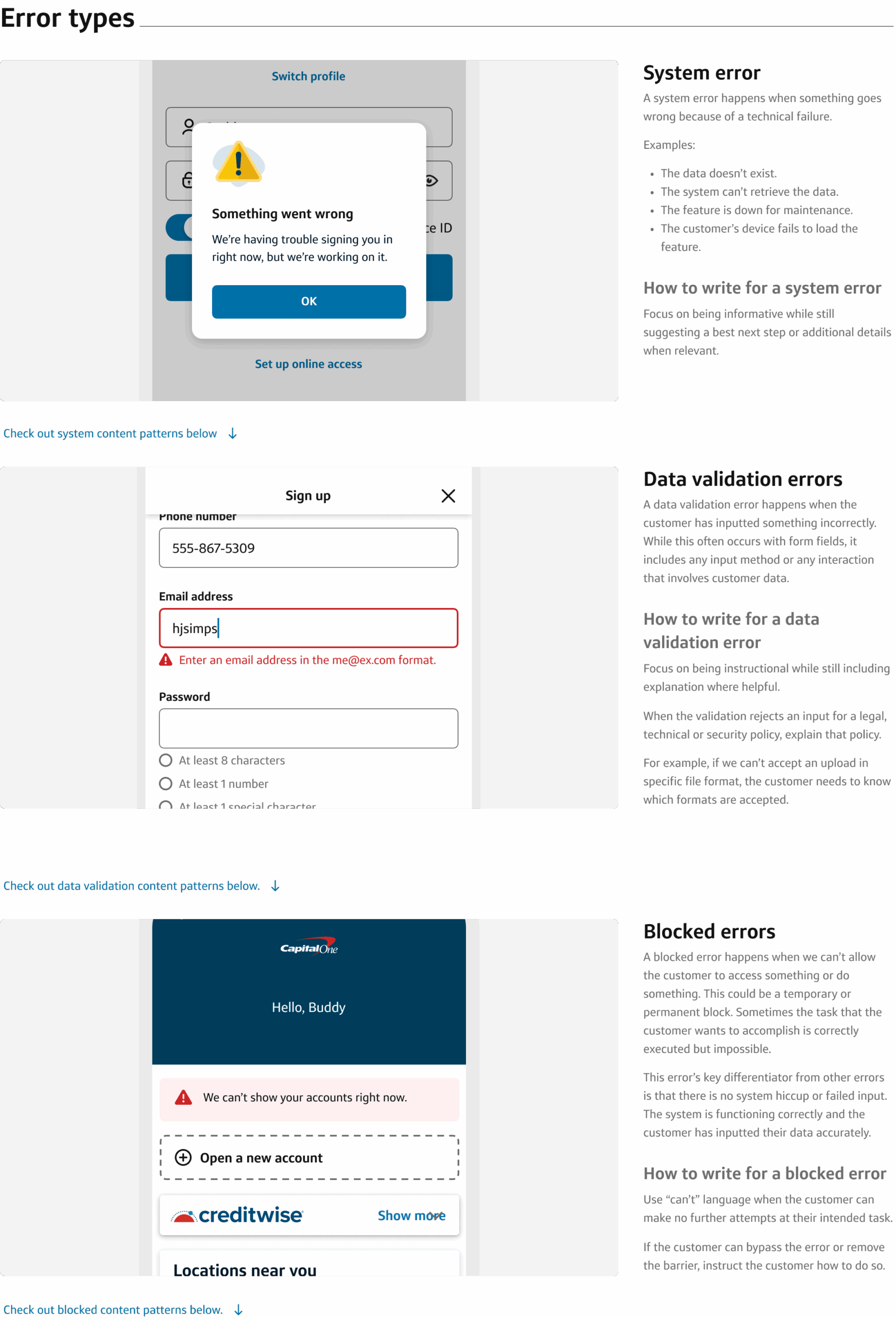
- Error types weren’t intuitive. For the designer to choose the right fill-in-the-blank content pattern, they needed to categorize their error into 1 of 4 error types. The most confusing of which was “policy violation,” a catch-all term for uploading the wrong file type to attempting an illegal action.
- Generic defaults were too easy. To bypass the confusion with selecting an error type, designers defaulted to using the most generic content pattern. This was a quick starting point, but it was often too vague to create a helpful customer experience.
- The original guidelines page was a wall of text. Because error guidelines 1.0 was initiated by content designers looking to correct error text inconsistencies, the guidelines contained only text, no images or mockups. Even examples of content patterns in action were text only. This limited its effectiveness at supporting designers when they were confused about error types and generic defaults.
2. Recategorizing error types
The legacy error types were the first thing to fix.
In the error messages workshop I created to teach teams the foundational UX principles that I had built my error message guidelines off of, I started by simplifying the pieces to our technology ecosystem as:
- Us: Our digital products as we’ve designed them to operate with our infrastructure
- Customer: The human in the loop who makes good and bad choices
- System in between: The technology between the customer and the intended customer experience
With the legacy error types, I increasingly relied on differentiating error types based on which part of the ecosystem “went wrong” and how that impacted the customer experience.
It was never an exact science, but I would mostly explain it like this:
- Data/Feature unavailable: The system went wrong when trying to deliver some part of the customer experience.
- Policy violation: The system worked as intended. The customer made an error by accomplishing the wrong task successfully.
- Input-level error: The system worked as intended. The customer made an error by failing to accomplish the right task.
- Fatal: The system worked as intended, but we need to block the customer from accessing any aspect of the experience.
But there were all sorts of problems with this.
- A feature being unavailable is a result of an error, not the cause. But these errors were most often tied to the system being the cause.
- A policy violation is a cause of an error, but it implies that there is some legal policy the customer is violating when the error type more often referred to technical policies like file formats for uploads.
- “Input-level” refers to where those error happen which is neither a cause or an effect of the error. This meant it was possible to have an input-level error due to a policy violation.
- Fatal refers to the severity of the result of the error. But a complete shutdown of the experience was most often reserved for fraud situations where the customer could not be allowed into the experience.
So instead, I testing these categorized with designers:
- System: These errors are caused by the system going wrong. It’s not working as intended and there is little the customer can do except to acknowledge the message.
- Data validation: These errors are hiccups in how the customer interacts with the system. Typically, they have to do with how information is entered into a form,
- Blocked: These errors significantly prevent the customer from doing a task. Because they block the customer on purpose, they are not a problem with our system or a problem with how the customer is interacting with our system in the moment.
Once I validated that these error types made sense to my audience, I wrote up the section for the new guidelines page. I was working out of Figma instead of Google Docs this time. This put me in a place where I could be more intentional with the images that showed the error types. I used a diverse set of screen mockups that showed each error type in action.
3. Writing new generic error messages for versatility
Then, my design system team told me that we finally had tech capacity to turn design-only patterns into coded patterns. This was my cue to put more work into the generic content patterns.
When I had worked on error guidelines 1.0, I had been frustrated with how many vague and generic error messages existed in our app. An ideal customer experience would have used situation-specific language that would fast-track the customer to resolving the error. The more specific we could get without confusing anyone with technicalities, the better.
With time, I understood that generic error messages were popular because of their versatility.
Sometimes features are developed in such a way that multiple error causes are lumped in together. Designers are cornered into providing an error message that has no situation-specific details. Other times, there’s a need for a catch-all solution to cover any and all potential errors.
In my absorption of all info related to error messages, I attended a cybersecurity webinar put on by tech partners where I learned that specific error messages create security risks. A smart bad actor can exploit tiny hints in error messages about why an experience is blocking them.
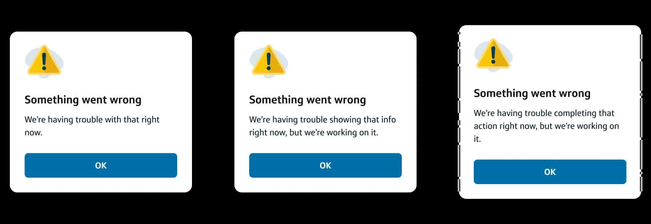
The error dialog our tech team was going was going to work best with static text. This meant this was an opportunity to lean into generic messages and make them as easy to use as possible.
I split the system error type and wrote two additional error messages, making for a total of three generic error dialogs. All three would work out-of-the-box as a complete package. The code could be copied into any feature without requiring a designer to make fill-in-the-blank modifications.
4. Communicating visually with an updated guidelines page
With the error types fixed and new generic messages written, it was time to tie everything into a bow.
The webpage with the error message content guidelines was a critical piece to helping designers understand the full picture. Ideally, it should take them from knowing nothing about error messages to core principles and then all the way to specific phrasing.
To achieve this flow from general to specific, I arranged the content hierarchy for the new error message guidelines to go like so:
- Universal principles: Principles to consider when working on any error message
- Content strategy: An error message should attempt to provide 3 bits of information (what’s wrong, why and how to fix)
- Placement: Principles about placing the error message in the experience
- Error types: Categories of errors
- Content patterns: Fill-in-the-blank phrasing suggestions
- Do’s and don’ts: Specific suggestions for common mistakes
The other problem to address was the lack of visuals in error guidelines 1.0. The guidelines needed convey information about how to write error text, but I believed there was a I way to visually explain abstract concepts.
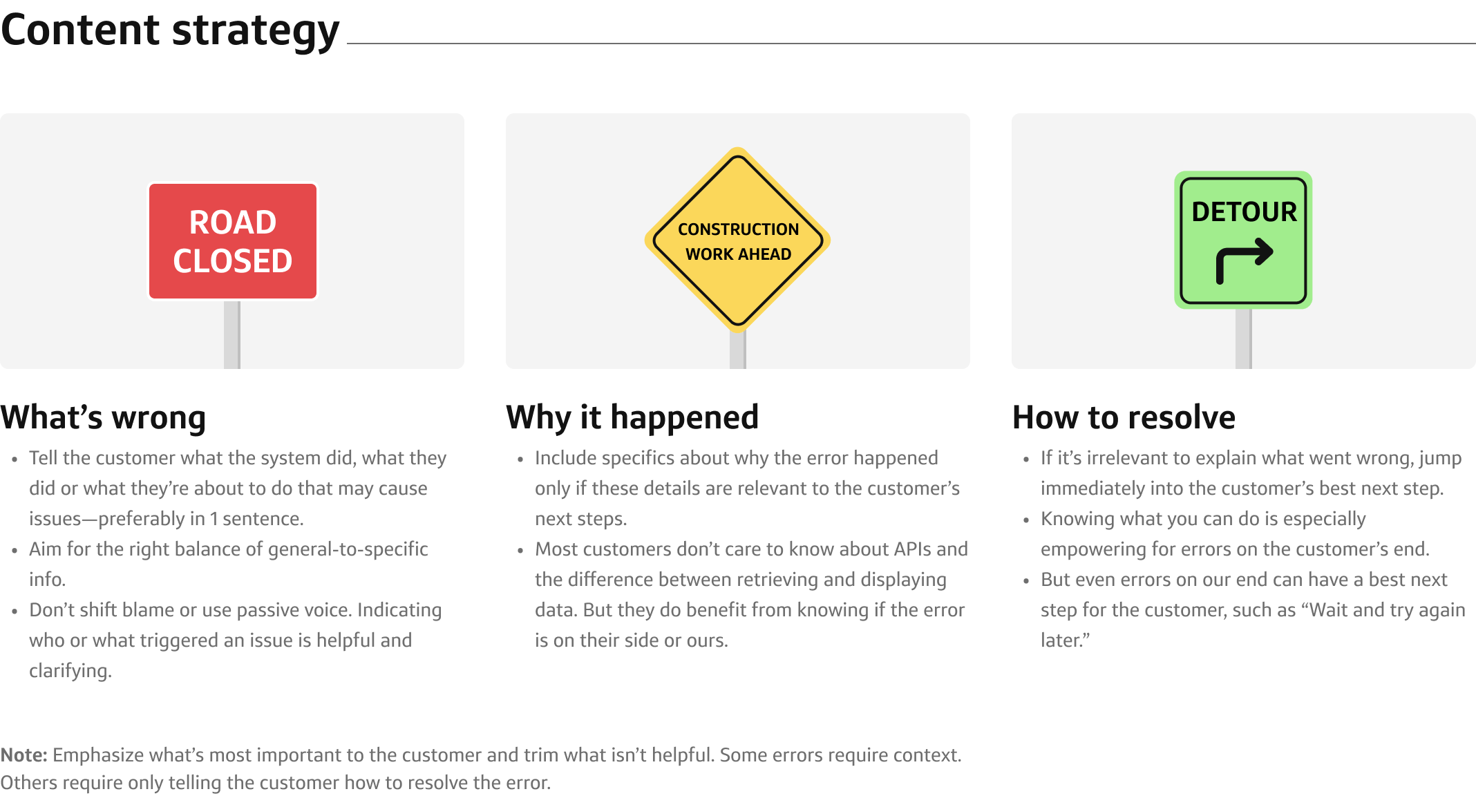
I kept coming back to street signs as the best visual metaphor.
- Street signs need to communicate necessary info in limited space. They’re like if billboards had a boring day job.
- Similar to error messages, there can be cautionary, informative and instructional street signs. Men at work. Scenic overlook. Exit now.
- They could have pops of color to attract a designer’s eye. If possible, I wanted to use red, yellow and green like the famous traffic lights.
So I made street sign visuals based on the content strategy section. A red “road closed” sign conveyed the part of error messages that should explain what went wrong, a yellow “construction work ahead” sign showed how added context to explain why can be helpful and a green “detour” sign drove home how front-loading actionable instructions is helpful to resolving errors.
Results
The new error message guidelines because one of our design system’s best hits. It was consistently in the top 10 most visited page on the guidelines site.
As a result of addressing user problems and communicating clearly with visuals, the page started to do my work for me. Designers other than me were linking to the guidelines and passing on all of the knowledge I had acquired about error messages.
I was no longer meeting with confused designers to review their error messages and rewrite their work for them. Everything was already on the page. Developers I never met were consuming error dialog code and using the correct language in their experiences. The entire ecosystem around error message design was accounted for and able to be self-serviced without input from me, the “foremost error message subject matter expert.”
The proudest moment of this work was when someone quoted the guidelines back to me without realizing I had written it. That’s when I really knew that the thoroughness of my expertise was worth it.