Problem
The reason for the spreadsheet: error messages across our organization were in a disorganized state. There were some helpful tips scattered across a handful of sources. Some of them featured examples with language that we would like to phase out.
Approach
- Read all currently available resources on error messages
- Organize examples of error messages into a spreadsheet
- Ask the content community to submit their examples
- Iterate on samples to determine content patterns
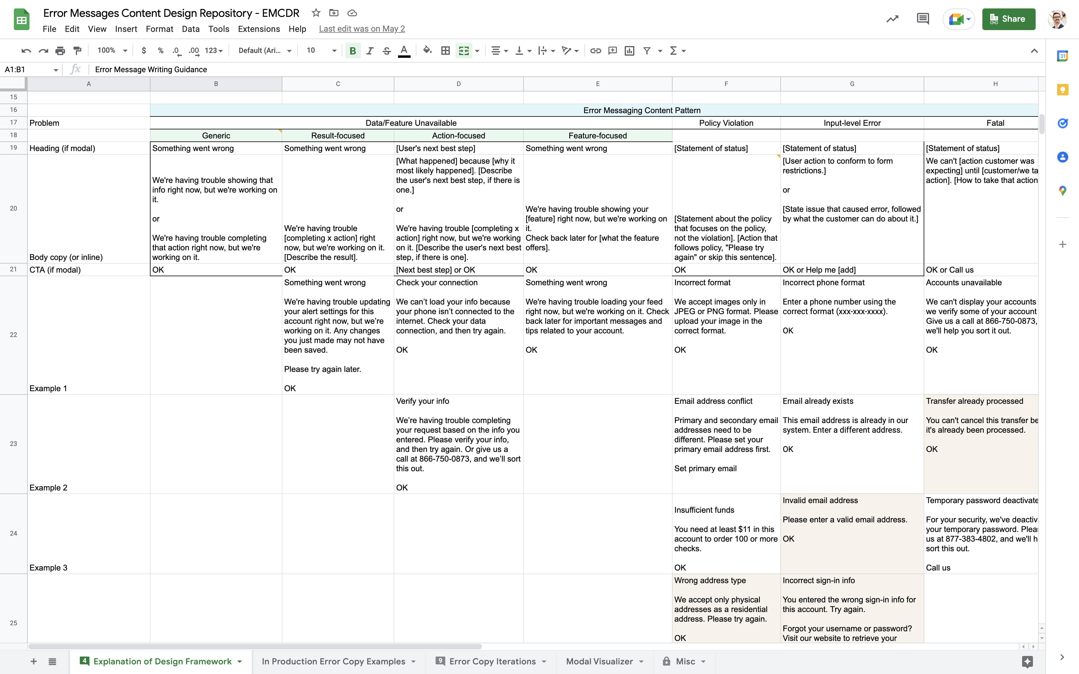
- Codify content patterns with concise guidance and visual examples
Reading all currently available resources on error messages
I started the project by digging in to what resources were already saying about how to write error messages.
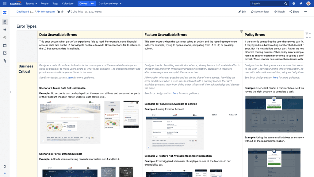
One of the resources had a sizable chart explaining the types of errors. While it seemed like a good place to start, the chart was too unwieldy to understand at a glance.
I condensed the chart into a glanceable size and presented it to the team. I explained my understanding of why error scenarios were grouped the way they were.
Organizing examples of error messages into a spreadsheet
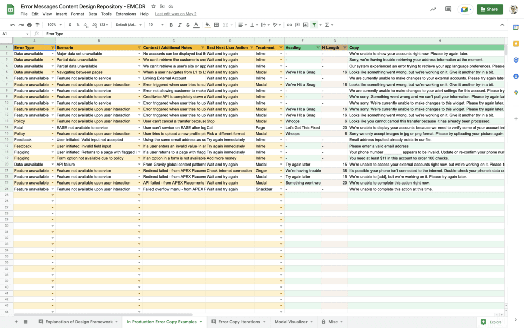
Thinking in rows and columns helps you look at many content samples laterally across dimensions.
For example, I set up columns for the heading, body and CTA, but I didn’t stop there. I made a column for the scenario, another for the visual treatment and another for the general notes. I even set up a column after the question “what’s the user’s next best step?” kept coming up in discussions.
Once the columns have the dimensions that you’d like to explore in the content samples, each row can be a new sample. You can glance down a column and see where headings are similar or where CTAs have inconsistencies. Plus, adding rows can be done by anyone who takes time to fill it out.
Iterating on samples to determine content patterns
Once we had enough samples, the team held a few working sessions to discuss.
As the team worked through each scenario, content patterns emerged. Each team member was able to weigh in a balance out the pros, the cons and the exceptions to any rule. I took notes on the rules that were the most robust.
Codifying content patterns with concise guidance and visual examples
The notes that I took during the working sessions provided a jumping off point for the written guidance.
Exploring my thought process in a flow chart
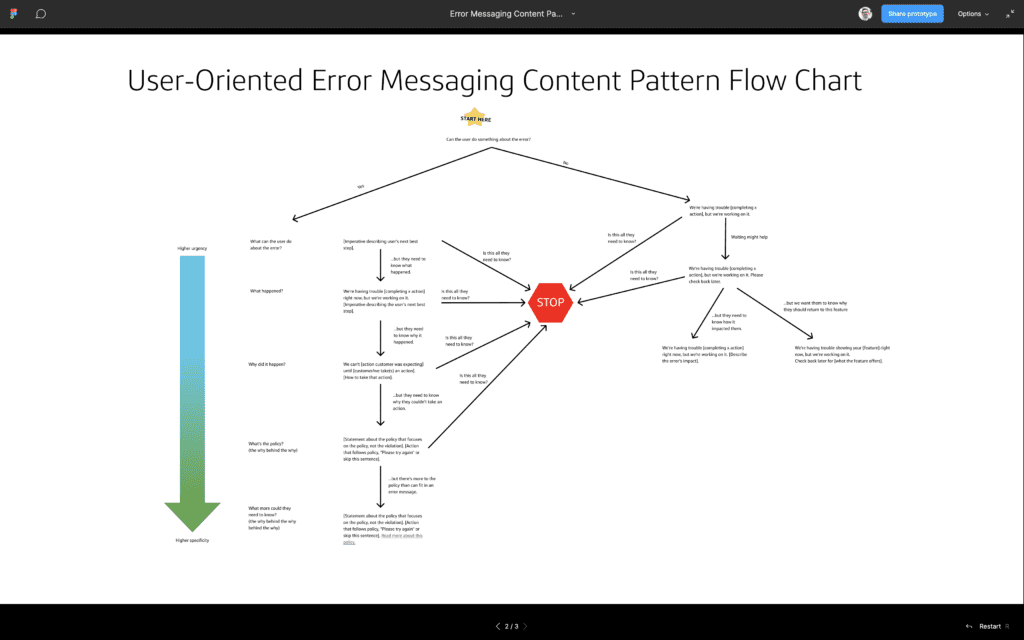
But before I got started on the first draft, I spent a little time organizing my thoughts in a flow chart. I was noticing a hierarchy in error message writing that I wanted to explore.
It seemed as though some error scenarios required an urgent explanation of what the user should do to resolve the error but all other information was irrelevant. In these cases, the user didn’t need to know why the error happened or who was responsible for it.
Other errors messages, however, would be absurd if the user didn’t know why the error happened. The context was calming. It convinced the user that they lived in a rational universe where things happen for a reason.
With these two scenarios in mind, I built the flow chart on a series of questions. Each question had an exit arrow that asked, “is this all the user needs to know?”
The flow chart sorted the content patterns into a larger web. At the closest point to the starting position, the emphasis was on urgency. At the furthest point, it was about specificity.
Writing the first draft
From the flow chart exercise, I had enough momentum to write the first draft of written guidance in one sitting.
I started with explaining error messages in the broader context of notifications. For an error message to be a unique type of notification and not something else entirely grounded the guidance terms that are universal across all types of notifications.
You read the first draft here >>
Result
Once the team had reviewed the first draft internally, we again took it to the broader content community to ask for input before submitting it to the new Gravity 3.0 standards.

